top of page
serving you a portfolio, one design at a time,
no calories, but plenty of flavour. bon appétit!
brand identity design
the bite site
design for RMIT University campus food store
w. hoyin dennis she, mai truc quynh nguyen, nichola audrey and ngoc minh chau nguyen

Brand identity doesn’t just make things pretty. It builds personality and signals the right expectations to the people experiencing it.


-----------------------------------------------------
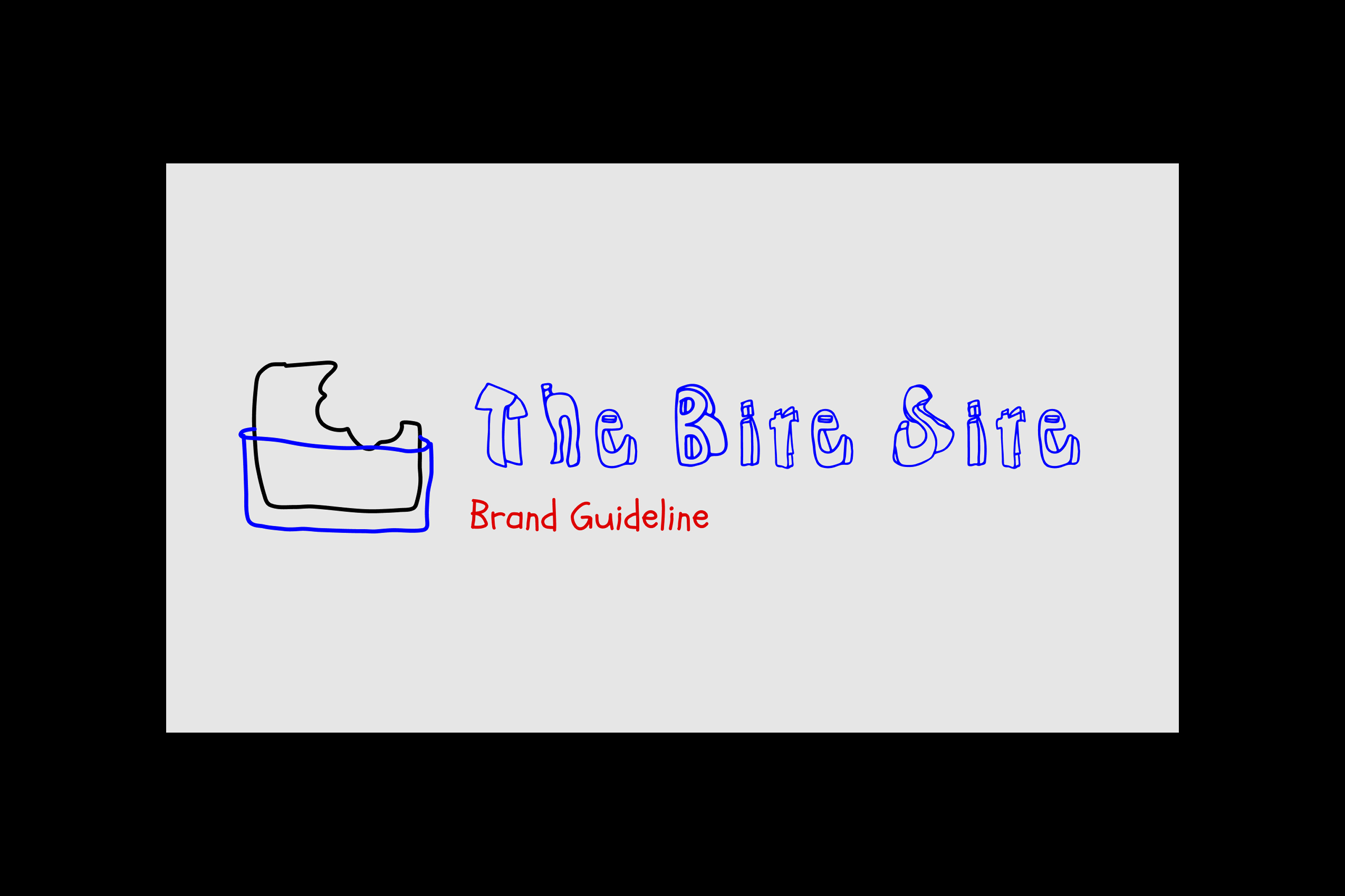
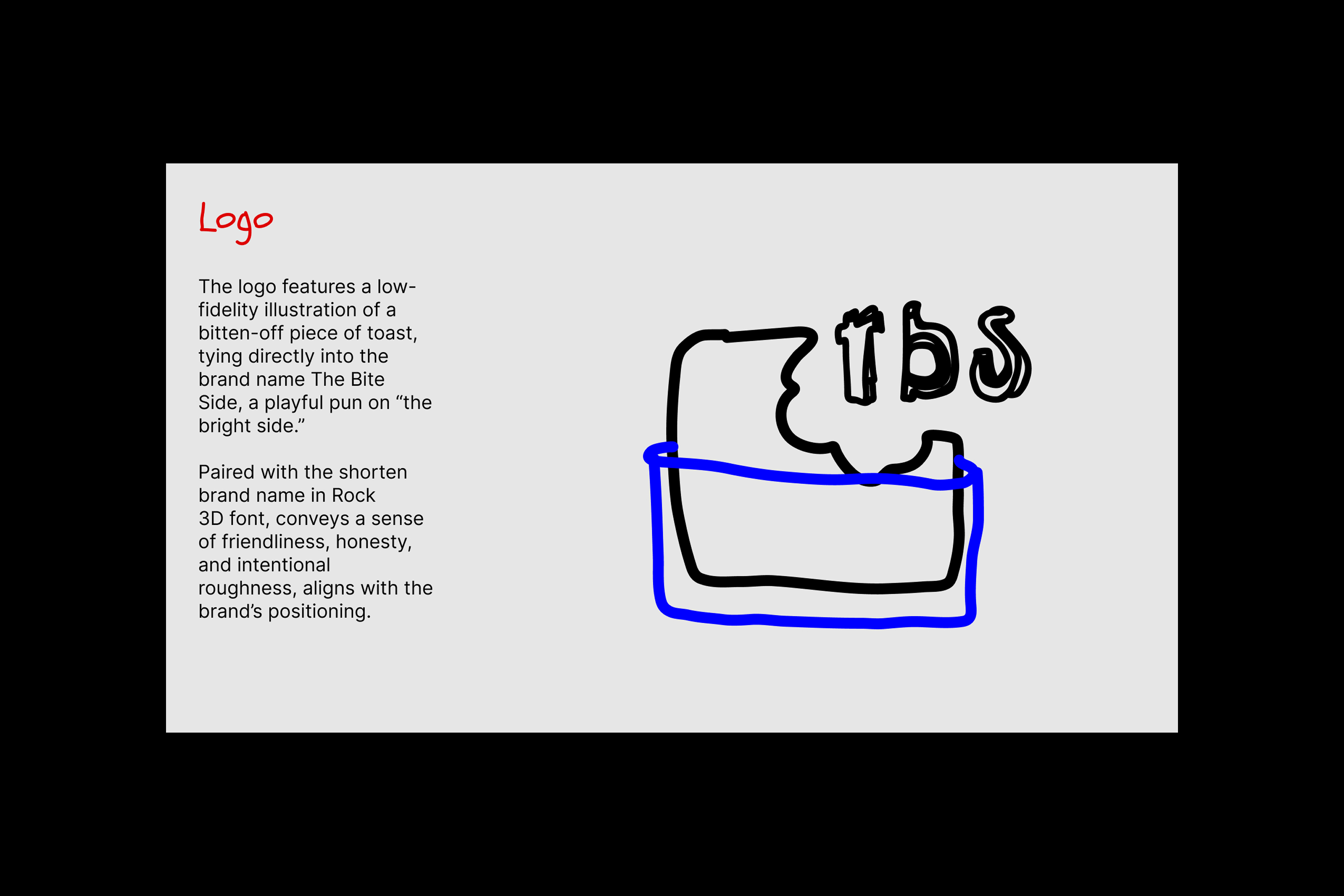
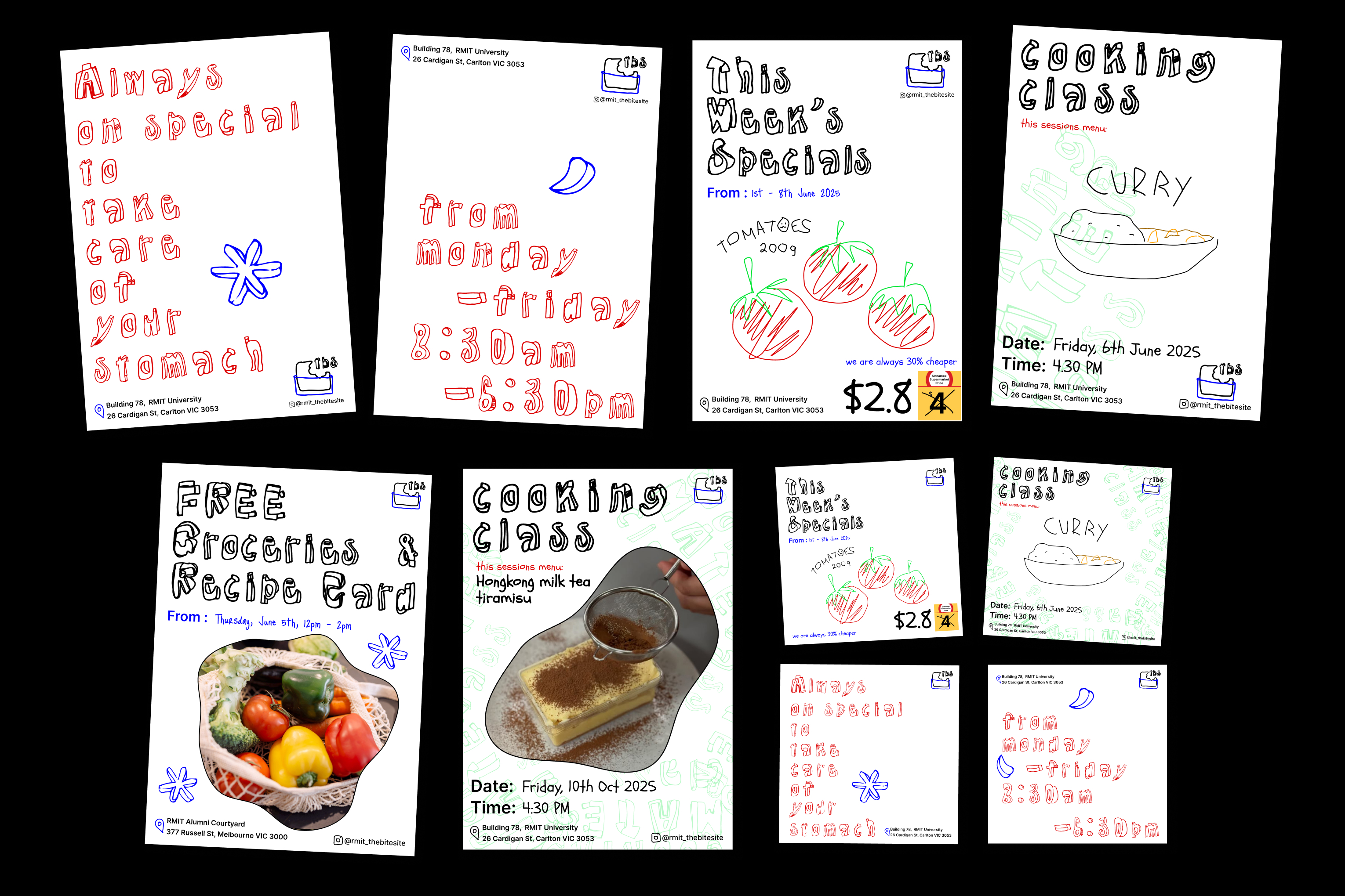
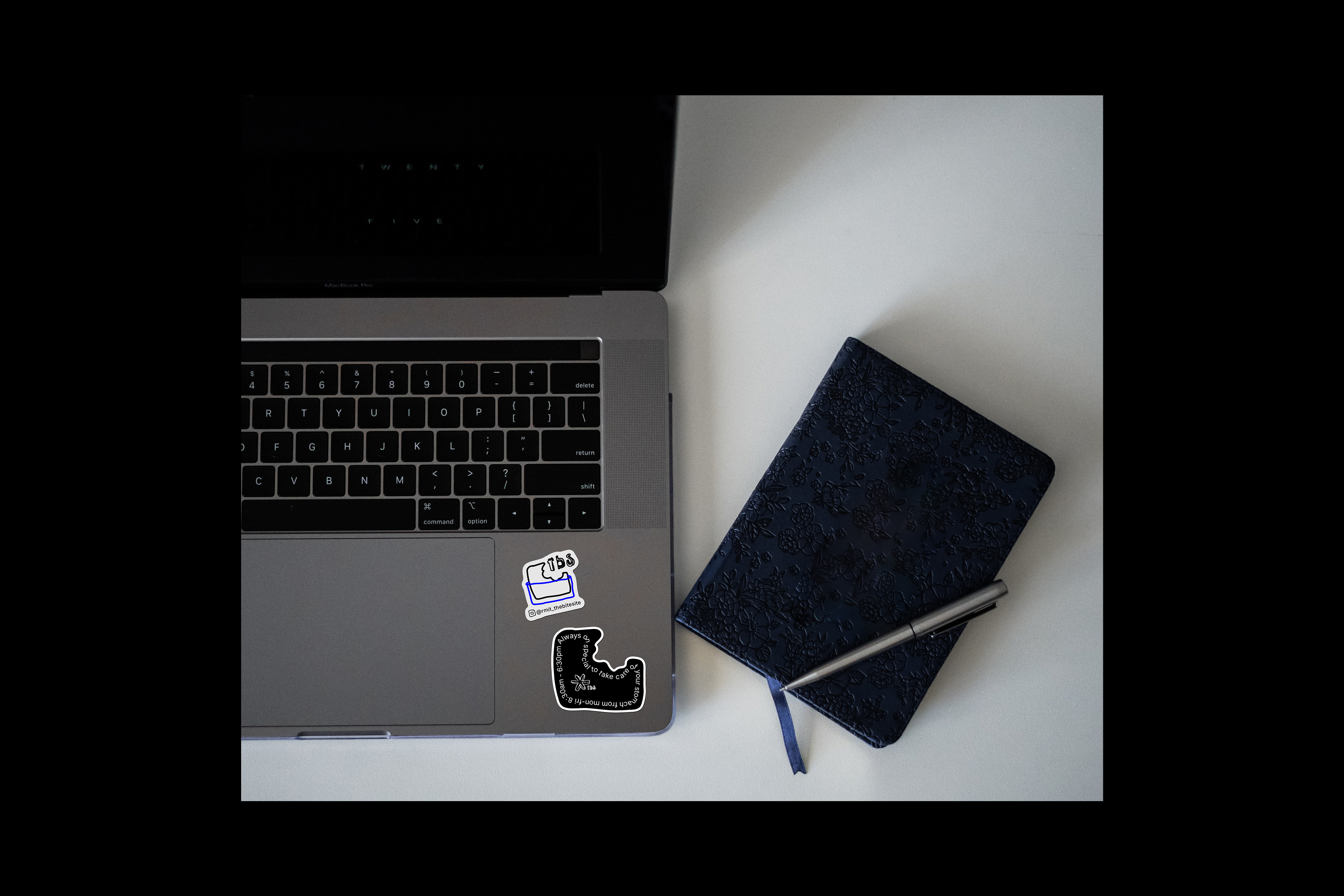
The Bite Site is a brand identity created for RMIT’s student-run food co-op, with a name that playfully echoes “the bright side.” It represents a cheerful, supportive corner of campus where a simple “bite” can make a meaningful difference. The identity embraces an unpolished, low-fidelity aesthetic grounded in trust, authenticity, and student-to-student community. Prioritising inclusivity and approachability, it reflects a space run by students for students: reliable, welcoming, and free from stigma. With a conversational, peer-led tone of voice, The Bite Site becomes more than a service. It is a campus presence built on care, solidarity, and shared ownership.
-----------------------------------------------------
rosie.in.sync
1000
x
purpose over decoration
1
x
nichola audrey
a copywriter who always knows what to write
1
x
ngoc minh chau nguyen
positive energy we cannot work without
1
x
mai truc quynh nguyen
communicator smooths group interactions
1
x
dennis she
quiet guy who works in 2.0x speed
4
x
service safari
exploring ethical food supply in melbourne
6
x
interviews
getting to know what students truly want
17
x
prototyping sections
listen and learn the feedbacks from students
1
x
figma
the co-working space we love
-----------------------------------------------------
the bite site
-----------------------------------------------------
06
03:55:25pm




bottom of page